Introduction
- Brand Strategy + Naming
- Brand Identity
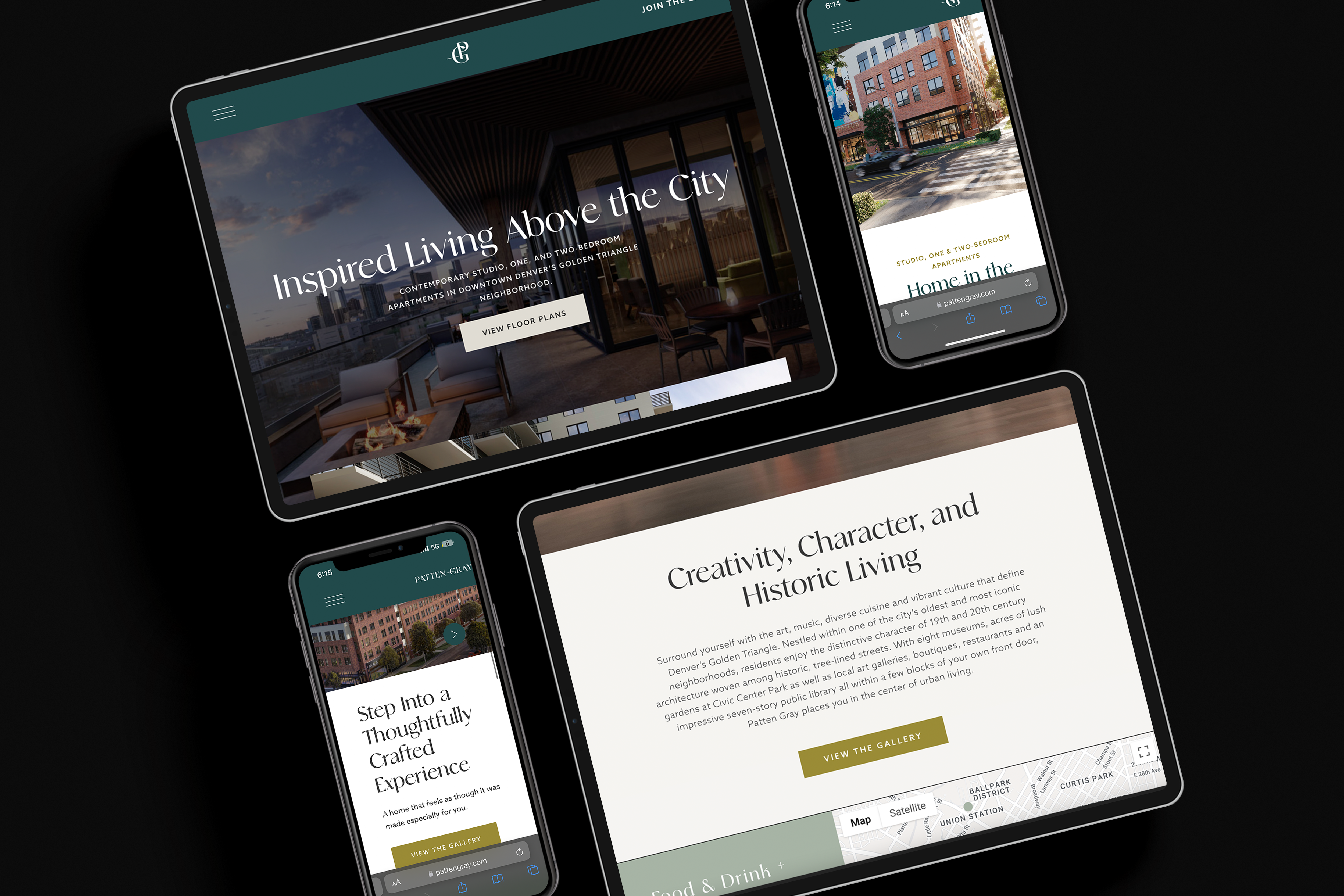
- Web Design + Development
- Wayfinding Signage
- Print Collateral
- Social Media
- Custom Montage Video
Brand Narrative
A hint of something more — bringing history forward toward a more comfortable contemporary. The stylized font is reminiscent of an older era, a filigree that conveys the significance of the individuals who placed their own stamp on the Denver landscape. There is a feeling of graceful movement that aligns with the connectivity, culture and cosmopolitan pace of the neighborhood. Consistency is found in a color palette that celebrates the tranquility and depth of cool blue hues found throughout the property’s interior, and the vibrant panache established with pops of golden yellow.
Logo Design


Kismet
Point of View
Apertivo Hour
Bristle Brush
White
Brand Identity
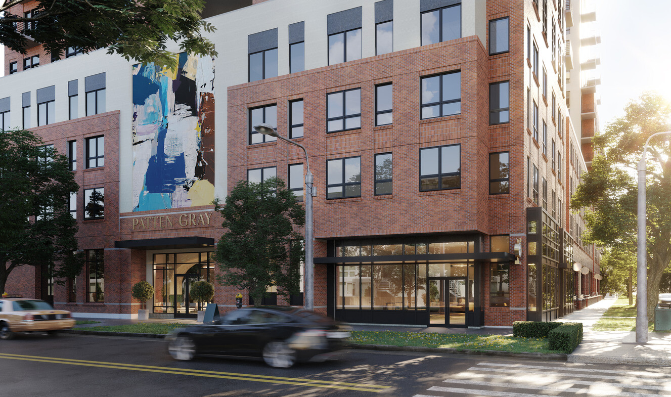
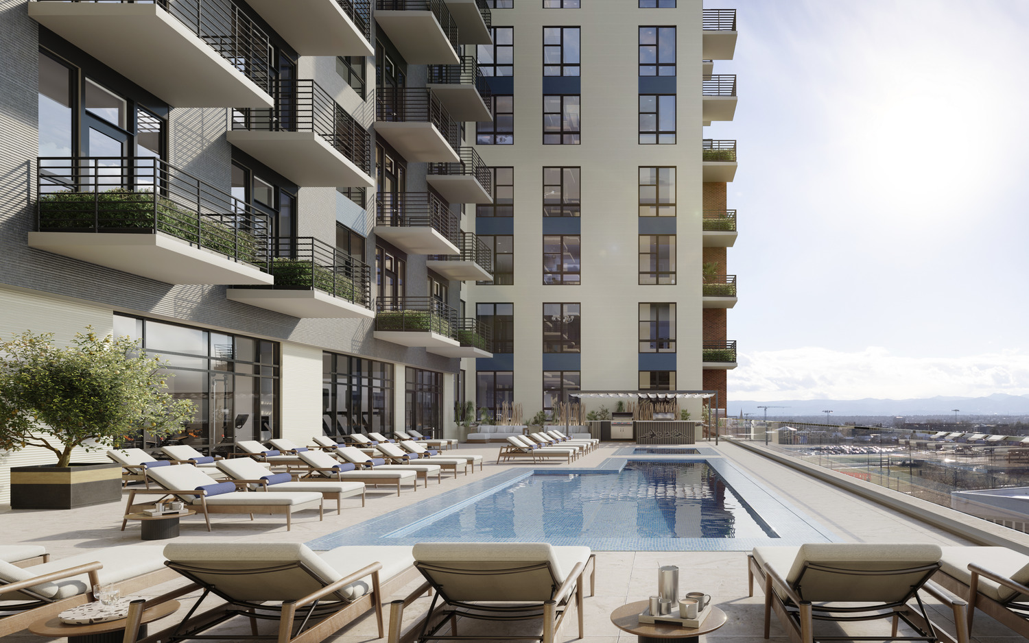
Each studio, one- and two-bedroom apartment at Patten Gray offers the rare opportunity to tell your story. Completely. Vividly. Distinctly. Whether you are looking for a quiet escape thirteen-stories above the city or a night immersed in the art and culture found uniquely in this historic and charming neighborhood, Denver’s Golden Triangle is the key to a storied urban experience. Here, every detail adds tangible quality to an already inspired life of style. Where inviting comfort meets with impeccable style in a home that feels as though it was made especially for you.
Typography
Web Design
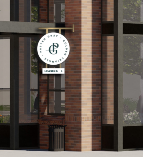
Wayfinding