
Services..
Brand Identity
Print Collateral

274 Detroit St
Denver, CO 80206
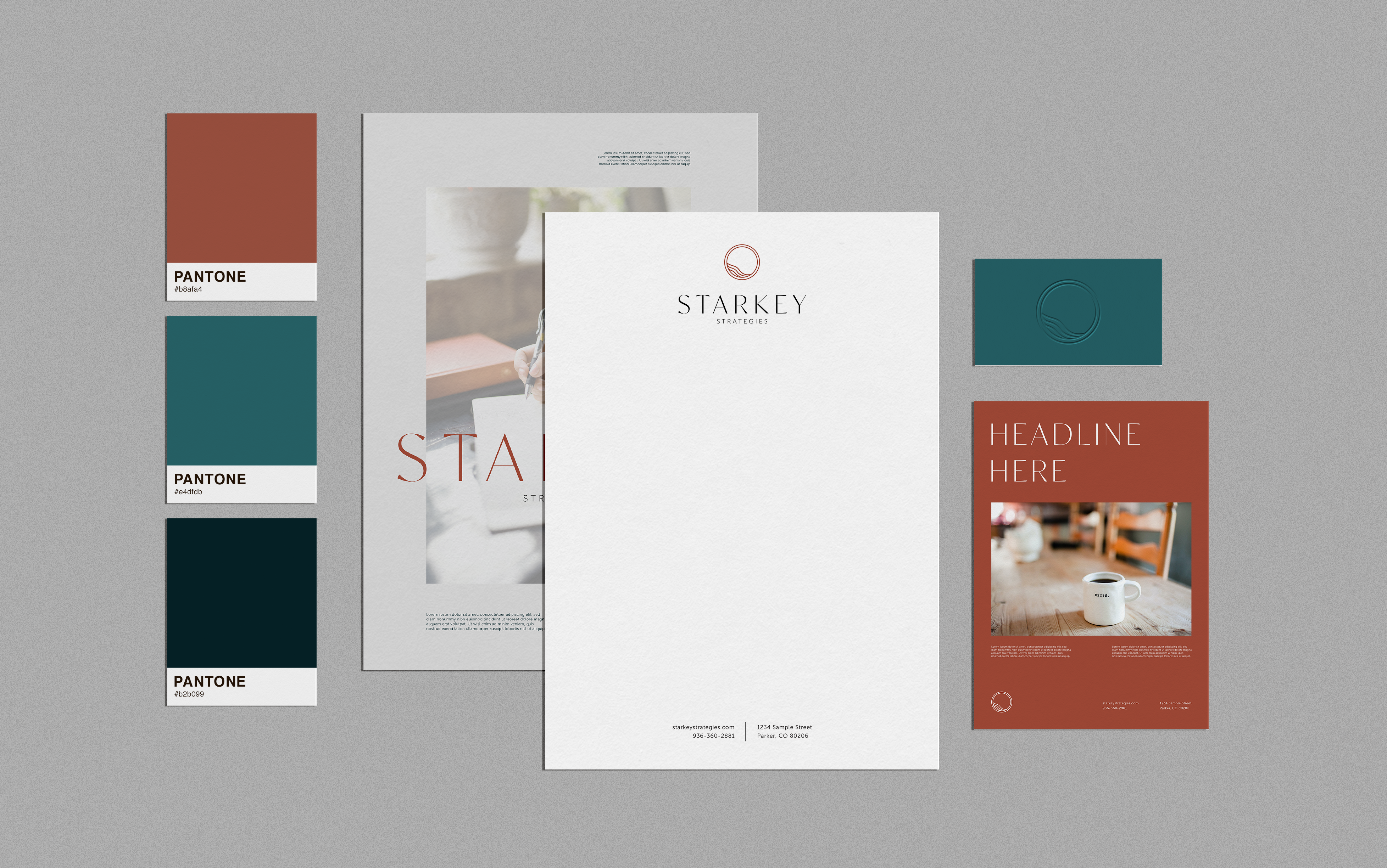
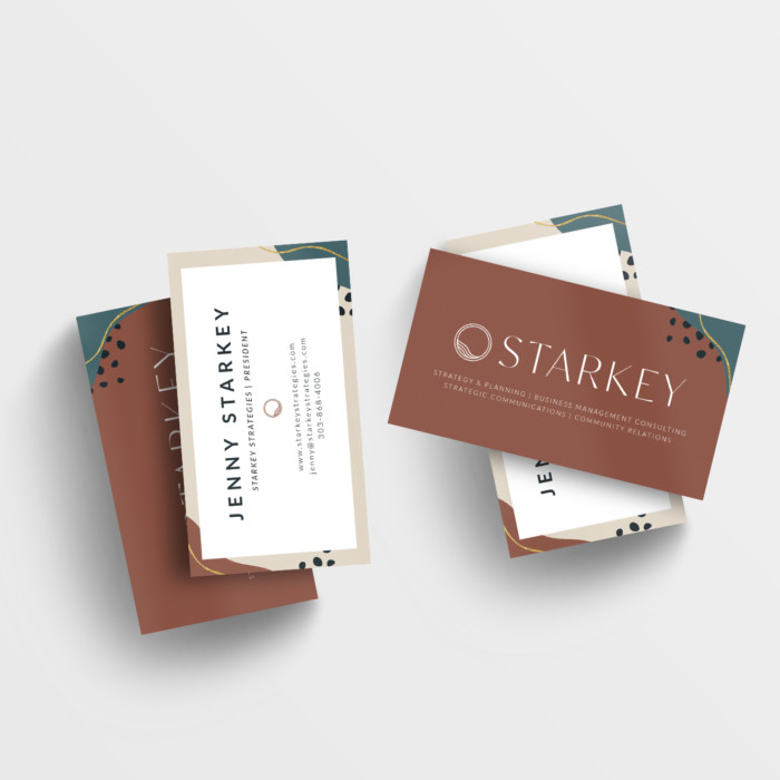
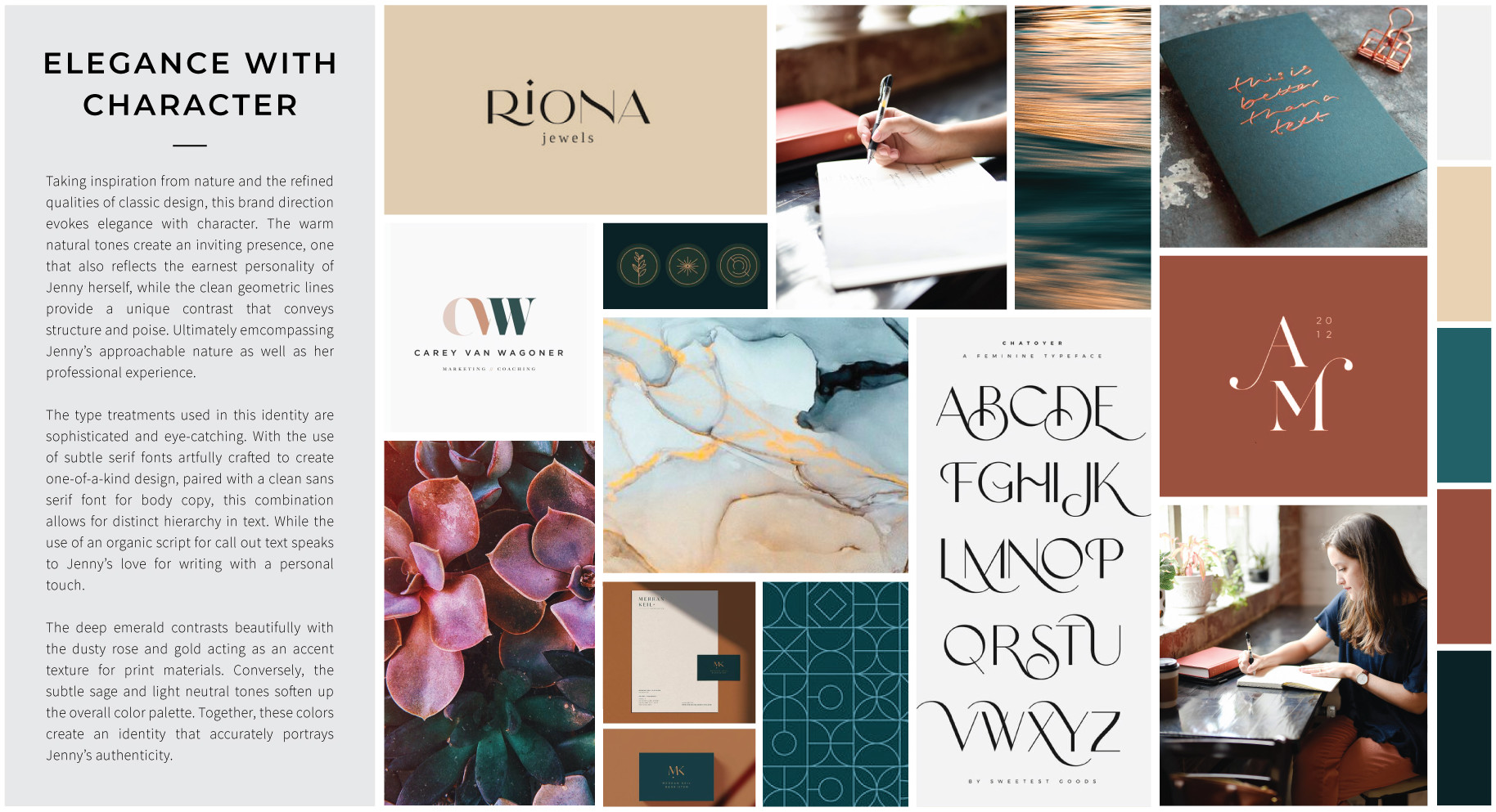
Taking inspiration from nature and the refined qualities of classic design, this brand direction evokes elegance with character. The warm natural tones create an inviting presence, one that also reflects the earnest personality of Jenny herself, while the clean geometric lines provide a unique contrast that conveys structure and poise. Ultimately encompassing Jenny’s approachable nature as well as her professional experience. The type treatments used in this identity are sophisticated and eye-catching. With the use of subtle serif fonts artfully crafted to create a one-of-a-kind design, paired with a clean sans serif font for body copy, this combination allows for a distinct hierarchy in text. The deep emerald contrasts beautifully with the dusty rose and gold acting as an accent texture for print materials. Together, these colors create an identity that accurately portrays Jenny’s authenticity.